Designing and developing an ideal brand logo is not just a work of art; it also requires a full-proof strategic approach. A business logo is not just the mere face of the brand; it also conveys the brand’s values and persona to its target audience. Besides, great logo artwork effectively establishes a brand’s presence and recall factor in the industry.
Thus, creating a business logo is a strategic blend of creativity and simplicity. An aspiring graphic artist must have a clear understanding of color, typography, and other crucial aspects to design a dream logo. This comprehensive guide will impart that insight to all beginner entrepreneurs and logo designers, helping them to come out of great fear about “how to choose a logo for your business online.”
Read this article until the end and acquire the skill of designing visually compelling logos that communicate brand essence and capture the audience’s attention.
Why are logos significant for businesses?
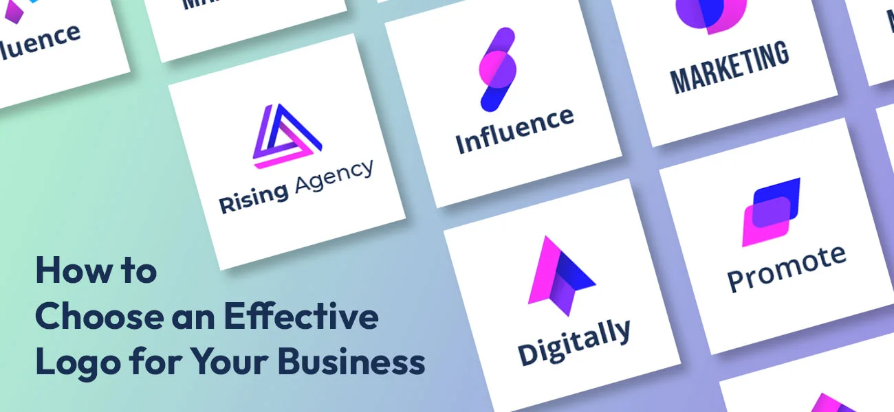
Ever since modern consumers became more visual-centric and branding became the norm, the need for a memorable symbol for a business organization started becoming an essential requisite. The main importance of a brand’s logo is its ability to reflect a company’s values and identity. Being the face of a brand, a well-designed logo helps onlookers quickly associate the brand’s name just by looking at it for a moment. This identification and recall factor fosters trust and loyalty among the audience.
Brand logos are versatile digital assets that work as a guide to a brand’s overall persona, its visual language, and corporate identity, as well as the brand narrative. On the whole, the logo is also a vital marketing and advertisement tool that plays on the psychology and emotions of consumers. A professionally designed creative logo evokes an emotional connection with a brand, reinforcing its aspirations for the customer.
Also, another factor that deserves special mention is that a brand logo sets the brand apart from its competitors, becoming a cornerstone in the competitive landscape. A cohesive and recognizable logo can be featured on a company’s website, marketing materials, business collateral, and product packaging, as well as on its social media handles. The key components in play are the symbolism, typography, color, and shape that give a distinct feature to the logo, making it timeless.
For example, whenever we see the iconic golden arches resembling an “M”, right away, we associate them with McDonald’s, the world-famous fast-food chain. The distinct lowercase “f” within a blue square in the Facebook logo is visually synonymous with the social networking giant. Another example of creative shape and feature is Starbucks’ iconic mermaid, or “siren” in its logo. The intricate design and the green color scheme are instantly recognizable to the renowned multinational coffeehouse chain.
Another instance that can be cited is Tesla’s stylish and minimalist logo which represents the cross-section of an electric motor. The logo is a superb example of symmetry and minimalism. These factors successfully reflect the brand’s two key values: cutting-edge technology and sustainability. Among so many types of logos, Tesla has chosen to be minimal and elegant.
All these good logo design examples cited above indicate one single thing: their creative designs have transcended cultural and linguistic borders.
Checklist for designing the best business logo
We hope that by now you have a fair understanding of the significance of logos for modern businesses. Going forward, let’s take a detailed glance at the ultimate checklist for designing the best business logo.
A well-crafted logo should seamlessly align with the brand’s values and effectively resonate with end users as well as stakeholders. Aspiring logo artists must be well accustomed to color psychology and typography; only then can they master the intricate process of designing an impactful logo artwork.
So, let’s begin with the handy checklist for how to design a logo for beginners.
Define the brand identity
If you are new to logo design and have a project to design a brand logo, first, understand the brand identity. Try to gain an understanding of the brand’s core value, USPs or UVPs (unique selling propositions or values), and, of course, the company’s mission.
The artwork you create must be an embodiment of the company’s core values and mission. Thereafter, try representing these elements within the design.
Do audience research and competitor analysis
The second strategy that comes in handy while designing logos for the first time is to analyze the target audience. Perform thorough research on the kind of audience the brand caters to define the demographics, user behavior, etc. This analysis will give you a clear picture of the contemporary symbolic elements and trends aligning with the demographic.
Also, do competitor research to understand what kinds of business logos your competitors are using. Doing competitive research is the best way to meet industry expectations.
Be simple and minimal
Always remember, in this modern era, simplicity is the key. The days of flashy designs and over-the-top logo shapes are long gone; minimalism rules now. Therefore, while sketching your logo wireframe, ensure the final design is easily memorable. Nobody remembers a logo that is too complex to remember with unnecessary bells and whistles in it.
Avoid complexities and keep the design extremely simple. This will escalate brand recognition, and the logo can also be used across multiple contexts.
Be versatile
Besides being minimal, as a logo creator, you must also be versatile when it comes to designing a company logo. Versatility is paramount these days since brand logos now have to adapt to different mediums, devices, sizes, and backdrops.
Designing a versatile logo means your client can easily display it on their business website, listing sites, and social media platforms, as well as in marketing collateral materials.
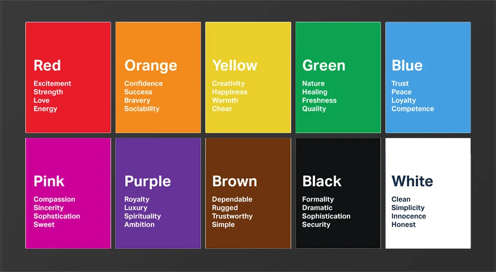
Color psychology is the key
Consider color psychology in each step. Because color scheme is the key component that inspires consumers. Incorrect or irrelevant colors can also repel them. Therefore, be very mindful while selecting the color scheme for the logo. The color palette must align with the brand’s persona and values, resonating with the target audience. Age and gender are prime elements.
Although several companies are currently adopting a more gender-fluid corporate identity, the generational age is still highly contemporary.
Select the font and typography carefully
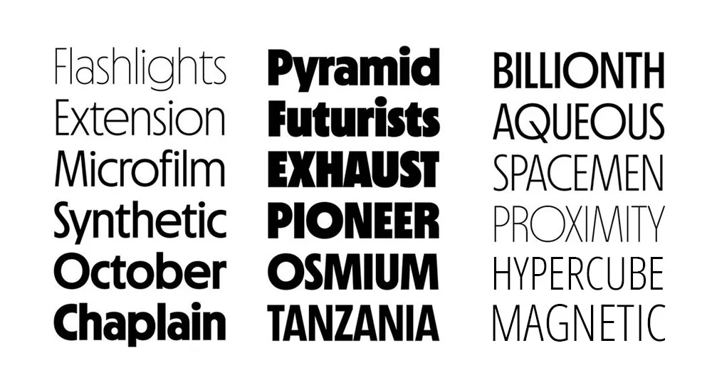
Typography matters a lot for any marketing material or digital asset these days. Logo designers must be careful while selecting fonts that complement the brand’s overall personality. Besides, the text must be readable enough, even from a sizeable distance. It should complement the aesthetic and not hamper the visual harmony of the logo.
Seek feedback and perform multiple design iteration
Remember, feedback is the ultimate, crucial element in designing and developing brand logos. Ensure to keep your clients and stakeholders in the loop for every development and creative conceptualization. Seek input from them and ask for unbiased creative criticism.
Refine these constructive inputs into the design and share the initial draft with your client. Repeat this process until you get the most effective and visually enthralling result. This process significantly impacts the logo design process.
Test the artwork across multiple contexts
Once you are done with the design, it’s time to evaluate its effectiveness. Check the design on backgrounds like black, neutral, dark, white, etc. You can also use a textured background with any solid color.
Doing this will help you understand the impact and readability of the logo in different contexts. You can get several high-quality backgrounds online to test your logo.
Address the legal considerations
Lastly, ensure the design you create is not plagiarized in any way. There is no harm in drawing inspiration from a well-known design and incorporating similar features into one’s own creation. But if it is a straight-cut copy-paste, major plagiarism and design copyright issues can arise.
Also, be extremely mindful of the trademark so that your design is unique and doesn’t fall under any trademark infringement. This last point is pivotal for any logo design and development project.
Whether you are a beginner or a pro, address the legal considerations properly to prevent any legal complications. By doing so, you will also save your client(s) from undergoing any legal ordeal. If you want to design your logo on your own, you can easily do that with the help of online logo makers. However, only professional graphic designers have the expertise to handle any legal hurdles.
7 crucial elements an ideal brand logo must have
If you have reached this point, congratulations. You have almost mastered the art of designing the best business logo for your clients. In this final section, we will touch upon the main elements every brand logo must possess. With these crucial elements or traits present in any business logo, brands can make a strong first impression. As well as convey meaningful messages across.
Each of these elements is vital in its own way, and designers must prioritize them for the effectiveness of their logo designs. Brand owners must look for these traits in the logos created for their businesses.
Let’s quickly take a look at these components that make a good logo design.
1) Alignment with brand identity
This is one of the best traits of a great logo design. If you own a brand and have a graphic artist create your company logo, make sure the design is appropriate for your brand identity. An ideal brand logo is a visual representation or embodiment of the brand it represents.
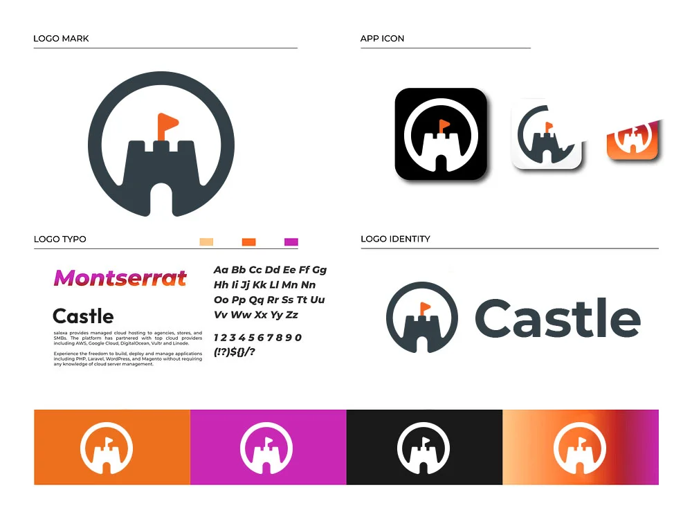
Hence, the color scheme, font, typography, and all other design elements must closely reflect the brand’s corporate identity. Only then can a cohesive, long-term, and authentic representation be possible. If it is a textual logo, the design must showcase the brand’s name creatively. If you want to know how to choose a logo name, check out the brand name first.
2) Readability of the design
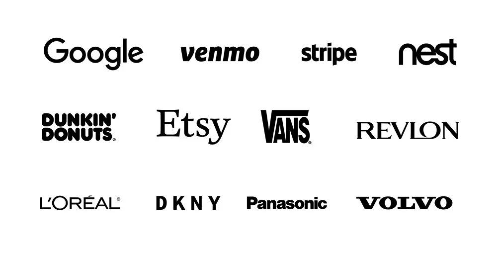
Also called “legibility” in industry jargon, the logo graphic must be adequately readable or legible. This is another important element of a great logo. If you wonder how to choose a logo for your business online, always ensure that the design’s readability reigns supreme.
3) Originality of the artwork
An ideal brand logo must be the most original and unique. It must be such a design that looks out-of-the-box and has never been produced. If your logo has a striking similarity with another brand, this will not only cause unnecessary confusion among your potential customers. As well, it will hamper your brand reputation.
Getting a highly original brand logo design is challenging; only professional experts with years of experience and expertise can pull off the job successfully. That’s why it is always recommended to hire professional logo designers for the most effective logo designs.
4) Relevant file formats
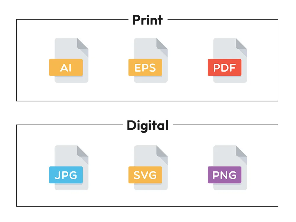
The right deliverables must always be present in the design that your internal design team produces or that you commission from an outside firm. This means all the relevant file formats must come with it in the final delivery. The most common file formats are PNG, SVG, EPS, PSD, PDF, etc.
5) How versatile is the design?
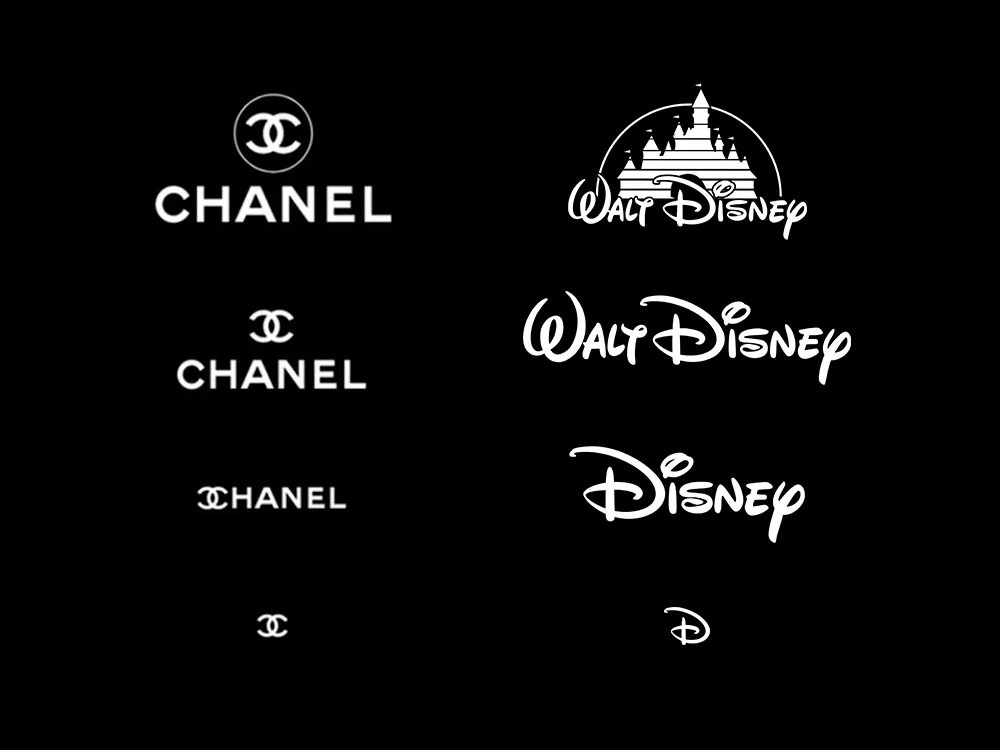
If you want to find out how versatile the artwork is, scale it down for a visiting or business card or get it enlarged for a billboard banner. Also, ask your design team to incorporate different backgrounds or contextual scenes and feature the logo against them. That’s how you can be sanguine about its effectiveness, regardless of the medium or context.
6) Is the design memorable?
If you are a digital marketer and have gotten the initial draft from your designer, see the design and continue with your daily work. If the design is memorable, it will leave a lasting impact on your mind. Try to recall the logo design after an hour or so. If you can still visualize the design or at least half of its silhouette, you’ve got a memorable logo for your business.
Alternatively, if you are a logo artist and have just completed your design, repeat the same process as mentioned above. See if you can distinctly remember the design. If yes, then you have created a masterpiece. If not, then the design needs further iterations. The idea is very simple. The design must help consumers quickly associate it with the brand. This is all the more important for a small business since these entities require quick recognition in the market.
7) How timeless does the logo artwork look?
Well, as we know, design trends come and go. Each year, we get to see new trends and approaches towards visuals. However, an ideal brand logo must stand the test of time. Yes, there can be rebranding, but the core essence of the original design must transcend time.
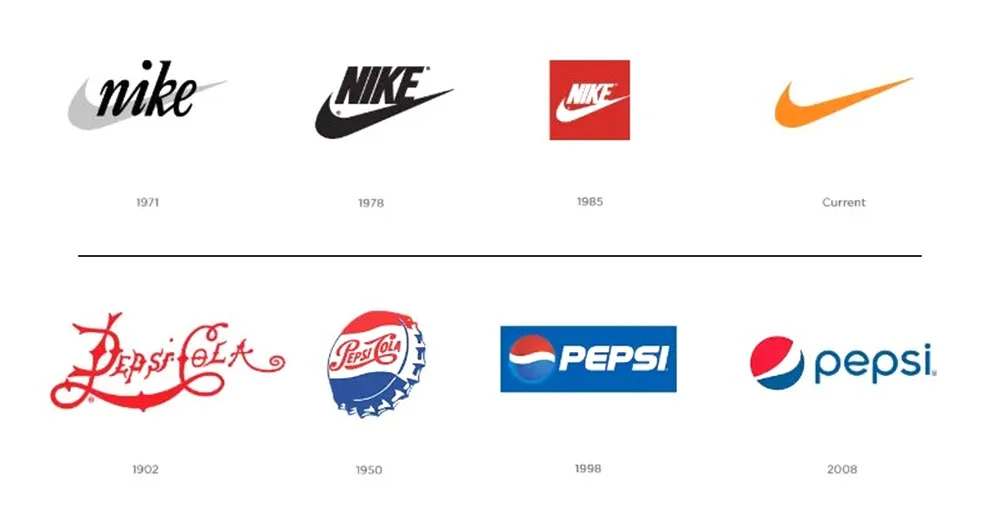
Try to avoid design elements that have a high chance of becoming obsolete with the turn of the new year. Avoid colors and fonts that look dated. Try to create an enduring appeal in the design that has made the brand relevant for many years. Business owners must look for this trait in their brand logo to create a consistent brand image.
Final words
In conclusion, the intricate process of designing a great brand logo might initially seem daunting. But with practice and commitment, beginners can soon see themselves as pros. We hope this insightful article will help readers successfully navigate through the checklist for designing a great logo and the key elements of the best brand logo.
Following this guide, first-timers can make the right choices pertaining to color palette, fonts and typography, symbols, and the like, and they can take up new projects with confidence. Also, this guide will guide start-ups in choosing the right logo for their companies.
There are professionals, too, who custom-design timeless business emblems and logos that communicate a brand’s narrative as well as its products or services perfectly. They have access to the latest design tools and have expertise across diverse industries. Hire such a professional agency for your next custom logo design requirement and leave a long-lasting mark on your audience. Good luck!

