Color theory is a fundamental concept of any chromatic design activity. Every artist ranging from web designers or graphic designers to architects and photographers understands that it is essential for any visual composition. However, a layman may not fully understand the importance of implementing it in a design. A color that seems visually pleasing to the eyes of a designer might look just okay to any casual observer. Besides, the reason behind a person’s choice of shades is always unpredictable.
The theory explains how different shades are perceived by humans and how it can mix, match, and create contrast with each other. Besides, it also plays a great role in communicating messages for the brands. So, understanding and implementing it will help in building a brand and get more sales. It is only a matter of 90 seconds that people will decide whether they like a particular product or not. Almost 90% of that decision is completely based on the color of your websites or logos. So, it is very important to start paying attention to that for covering all your branding and marketing needs.
Different Color Mixing Models
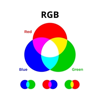
RGB
It is also known as the additive color mixing model and allows you to create different shades by combining red, blue, and green sources of light with different intensities. You can add more light to make the mix brighter. Similarly, the opposite can be done if you need to make the mix lighter. If you mix all the three shades of light, then you will get white light. TVs, projectors, or screens use RGB as their primary shades and mix them to create other cool shades.
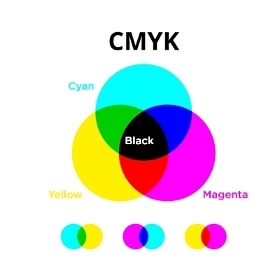
CMYK
The subtractive color mixing model or CMYK is any shade that you see on the physical surface of a paper, packaging, or signage. In this case, the term subtractive refers to the fact that you will be subtracting the light from the paper by adding more pigments. Earlier, the primary shades used in this process were red, yellow, and blue. However, when color printing emerged, the process was later replaced with Cyan, Magenta, Yellow, and Key (Black), which is otherwise known as CMYK. The combination enabled printers to produce a wide variety of shades on the paper.
Various Terms Associated with the Color Theory
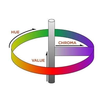
Before we logically explore the theory, let us start with knowing all the definitions of the basic terms used in this field.
Understanding the Color Wheel
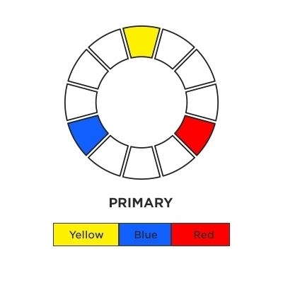
The first color wheel was created by Sir Issac Newton back in 1666 and always kept on changing after that. The wheel is mainly used by graphic designers and artists to develop harmony by mixing up the palettes. It consists of three primary, three secondary, and six tertiary shades. By understanding the terms and processes that go with it, you can communicate your vision appropriately with your designer.
Primary Colors
According to the classical theory, it is said that primary colors are the three shades that cannot be created by any combination of shades on the wheel. It usually contains pigments like red, blue, and yellow.
Secondary Colors
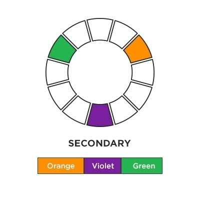
The secondary colors are usually created by mixing up the primary shades. It is used in the theory and graphic design just as often as the primary ones. The three secondary shades are green, orange, and purple.
Tertiary Colors
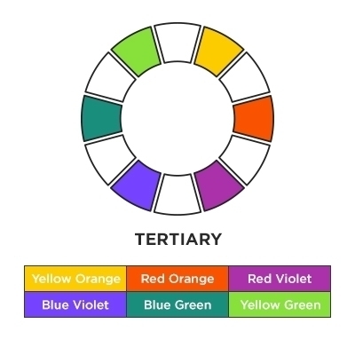
These are created by mixing up the primary and secondary shades, which is why each of the shades has a hyphenated name. The six main tertiary colors are yellow-green, blue-purple, blue-green red-orange, red-purple, and yellow-orange.
What is Color Harmony?
You can use the shades or pigments harmoniously by understanding the various hues and important terms defined by the color wheel. The word “harmony” in the theory usually refers to the utilization of various combinations in the most appealing and pleasant way. You can do it by putting a lot of practice through design and composition.
Complementary Colors
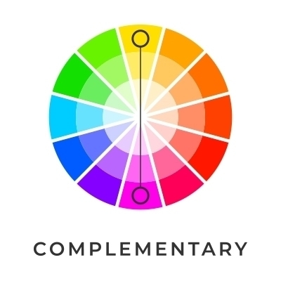
The complementary colors employ two pigments that are directly opposite to each other on the wheel. For example, consider red and green. The sharp contrast between the two shades can really make imagery pop by making each hue vibrant. However, overusing it can also get tiresome. This type of harmony is the most understood in the theory and is widely preferred for visual composition. Another subset of complementary color harmony is the spilt-complementary design in which one of the two contrasting hues is divided into analogous shades for greater variation.
Analogous Colors
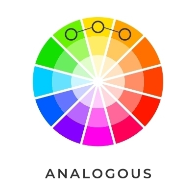
In analogous color harmony, there is only one main or “root” shades and two or more shades are close to the wheel. For example, let’s take red, orange, and yellow. In this scheme, only one shade dominates, the other supports, and another accents. It is one of the most simplest and reliable ways of creating an attractive and appealing composition. The analogous designs when combined with complimentary shades and a variety of other harmonies can result in diverse chromatic effects. In businesses, the schemes will not just be pleasing to the eyes but also instruct the customer to where and how take the action.
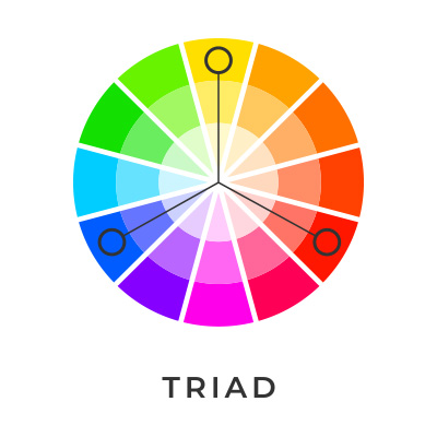
Triadic Colors
Triadic colors use three shades that are spaced evenly, i.e., are present at an equal distance from one another` on the wheel. The design is more complex than that of complementary shades but is based on the same principle. Mostly, it is used by marketing businesses to create both visual contrast and harmony to make the product stand out while making its image pop. You can successfully create a striking visual contrast by using 3 hues that are farthest from each other on the wheel. Examples of triadic shades include both primary colors and secondary colors.
Importance of Color Theory in Marketing and Branding
The way of interpreting colors solely depends on personal experience. However, it is still a fact that it can persuade and affect consumers in various ways. A marketer can influence their customer’s perceptions and convince them to purchase by using particular shades and graphic design. The only thing they need to learn is the psychology behind the theory. Apart from that, it can also help to know the different branding techniques that can connect them better with the audience. Eventually, it helps in bringing profits and strengthens the brand-customer relationship.
That is why while choosing the shades, it is important to know the personality of your brand, depending on which, you can select it that will suit your business or products. Furthermore, make sure that the shades you choose should stand out from your competitors. Decipher the personality which your brand fits and create your logo design, website design, or any other marketing-based stuff in such a way that it makes the most sense and reap sales by appropriately appealing to your targeted audience.
Now, that you are armed with the fundamental knowledge of color theory, you can start implementing the shades in your very own design and composition. It can help your brand to stand out from the crowd and create the desired appeal for your targeted audience. However, you just need to practice and learn how to appropriately use the color combinations. If you still have questions in mind, then you can contact the experts working in this domain. You can also outsource your requirements to a leading graphic designing company and ask them to handle your projects. It is a far more convenient option if you are looking to save your time or energy.
